

🐴 How I turned 1,376 Substack notes into a website with Claude Code
From design systems and design iterations to Git workflows and deployment

The next cohort of AI for Product Designers starts today!
I’ve written 1,376 Substack Notes since 2024.
Notes is a lesser-known feature of Substack. It’s similar to Twitter.
It’s my little corner of the internet where I jot down thoughts. Sometimes about AI and design, but way more often impulses I feel like sharing in the moment. Thoughts that feel a little too personal or vulnerable for LinkedIn.
Over time though, I found myself wanting to revisit older notes, whether to keep track of ideas, rediscover inspiration, or reference something I had shared before. But navigating through those notes on Substack was very difficult. I often ended up scrolling endlessly to find what I was looking for. There’s no way to sort and filter either.
So I decided to design, build, and ship a live website using Claude Code displaying all my Substack notes.

In today’s article, I’ll take you through the entire process end to end, from design systems and UI iteration to Git workflows and deployment, breaking down the technical details in plain language and explaining the reasoning behind the decisions I made.
Let’s dive in.
Overview
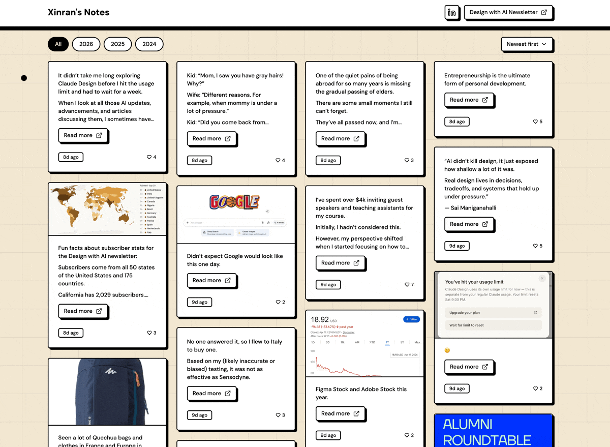
1. The outcome
This is the live site: https://xinran-notes.vercel.app/
Below is a quick snapshot:
2. How I built this
Here’s a diagram that gives an overview of how I built this. It follows the same structure as the rest of this article.
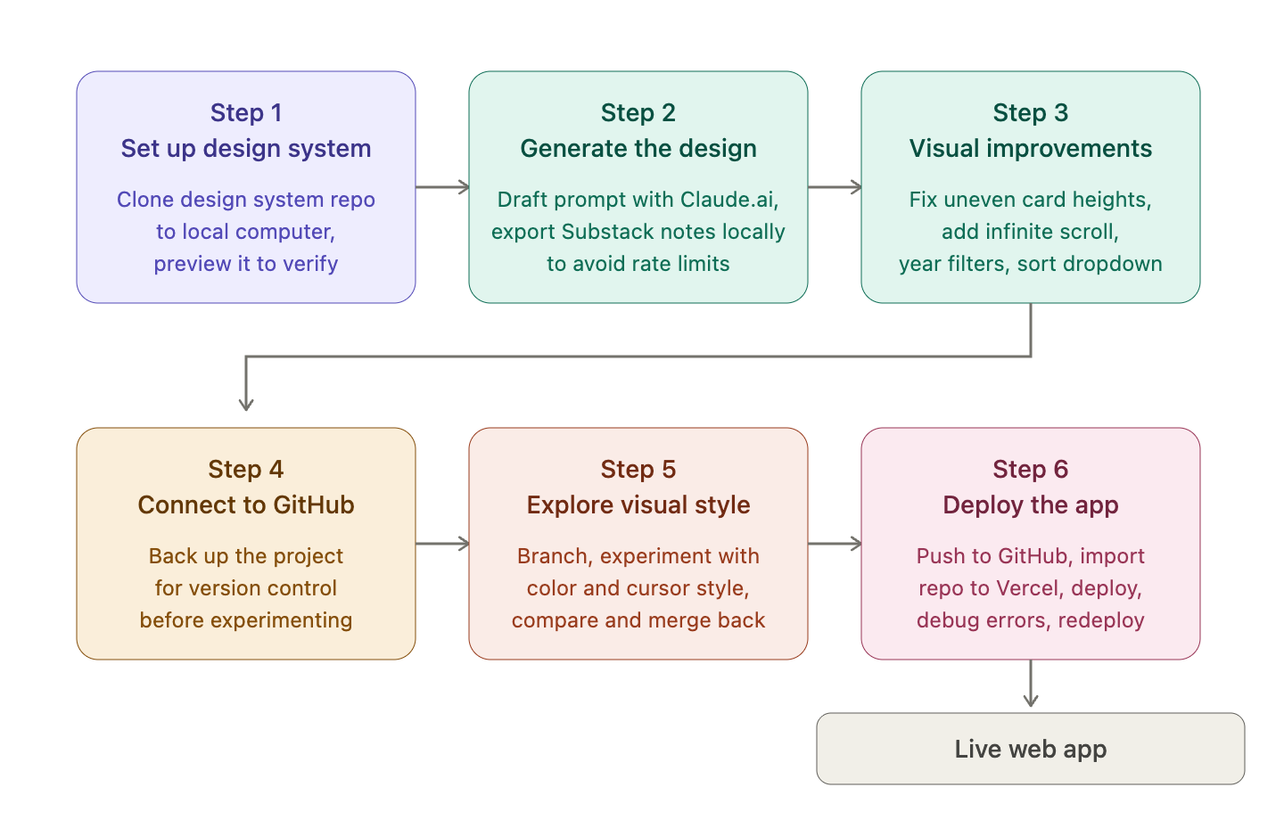
Step 1: Set up the design system
I wanted to start the design with an existing design system, using the same neo-brutalism component library mentioned in this article.
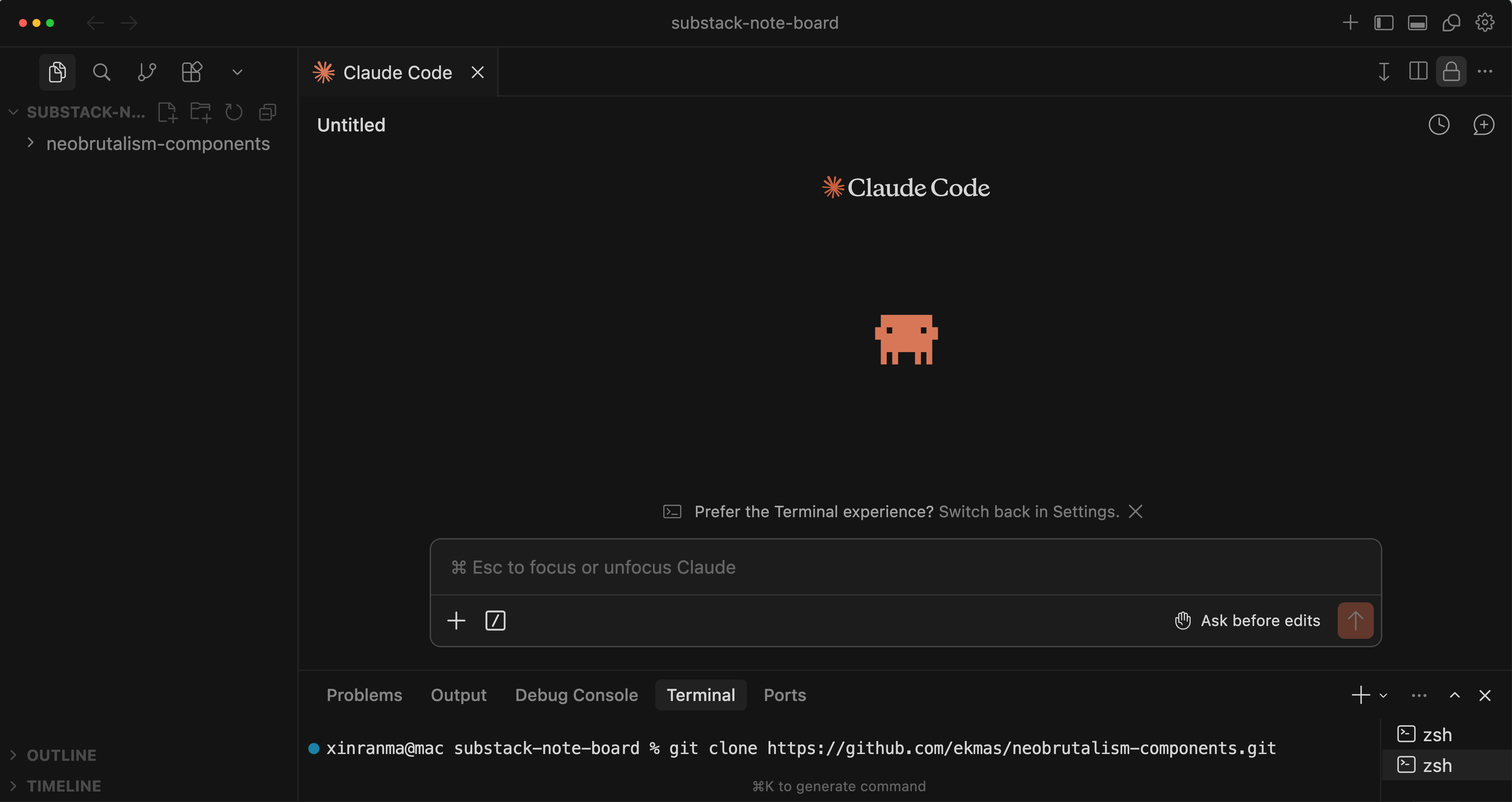
First, I created a blank project folder and opened it in Cursor. Then, in Cursor’s terminal, I ran:
git clone https://github.com/ekmas/neobrutalism-components.git
This clones the GitHub repo to my local computer so the AI can read the component code and generate designs based on it.
I used the Claude Code extension in Cursor.
After cloning the GitHub repo, the neobrutalism-components folder appeared in the file panel, containing the code that defines the design system.
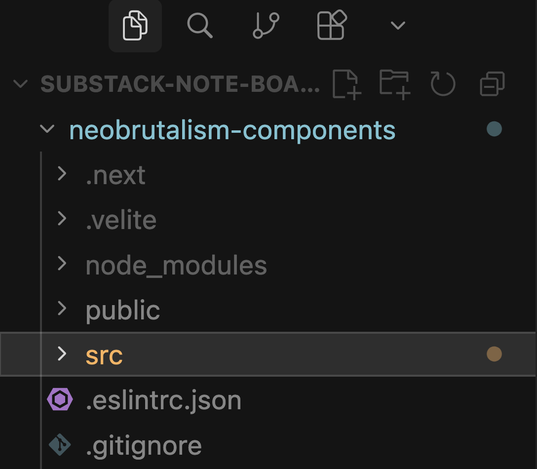
Then I previewed it in Cursor. I always do this to verify what was actually fetched.
My prompt in Claude Code:
I’ve cloned a design system repo. Explore the codebase to understand its stack, components, and design tokens, then create a component gallery page as the homepage.
The page should:
Show each UI component in its default state plus variants (sizes, colors, states)
Use only the repo’s existing tokens and components — nothing new
Be scannable top-to-bottom: component name, one-line description, then the variants
Then I got to see this.
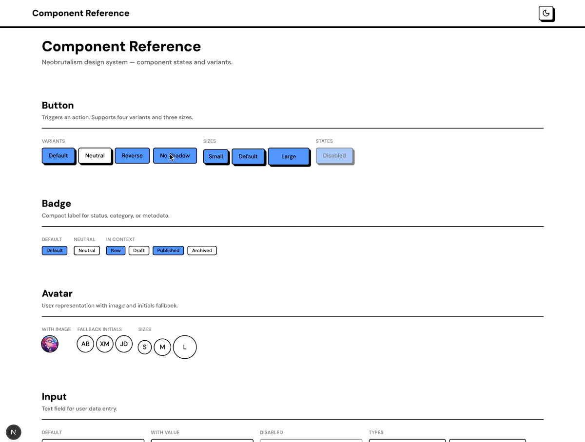
Overall, it looked great. I reviewed the components and liked the appearance.
The only issue that caught my attention was the color contrast of the primary CTA buttons. To verify accessibility, I used Cursor Browser tool to inspect the button and double-checked to make sure the contrast met accessibility standards.
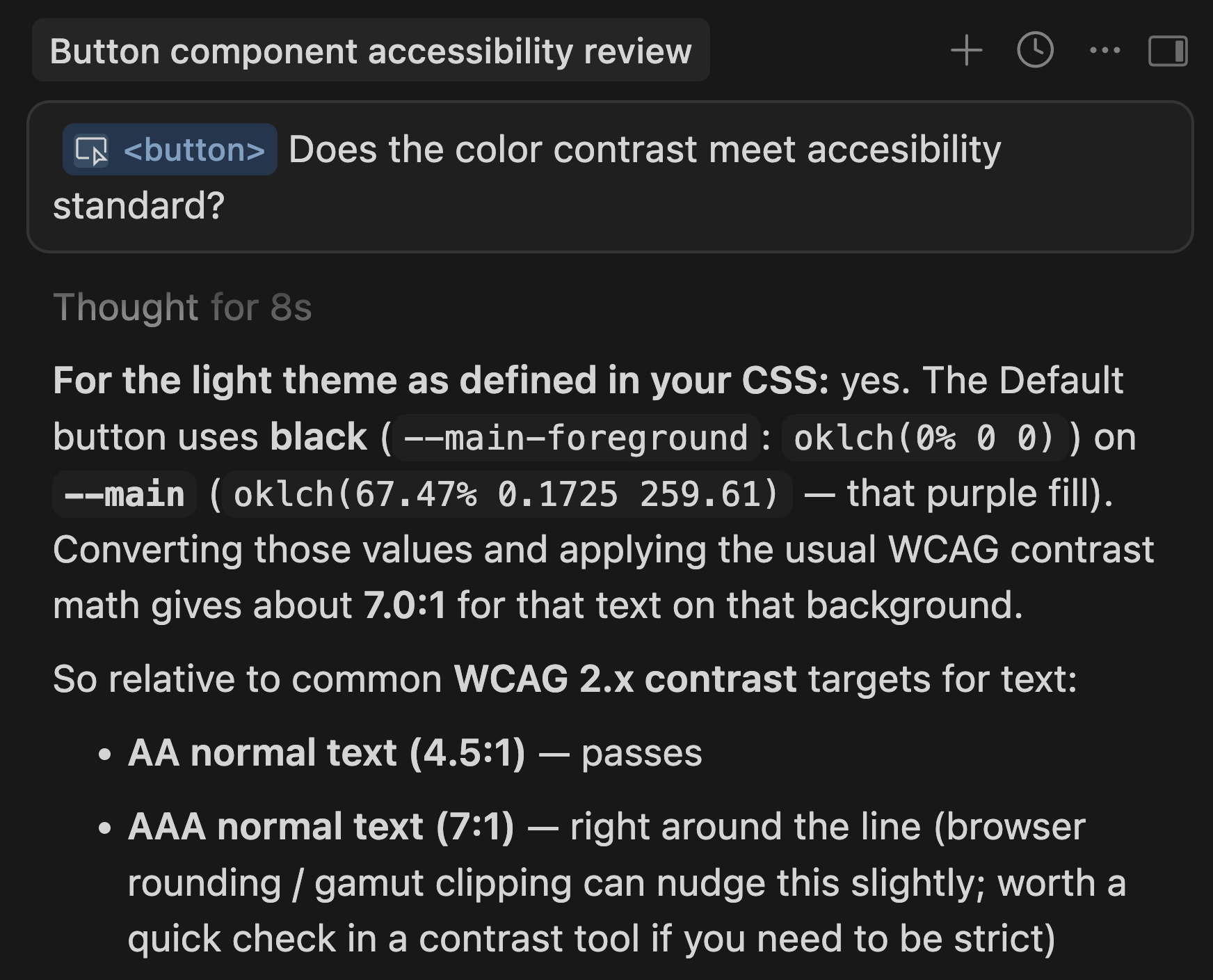
It actually passed the AA accessibility standard, so I moved on to the next step.
(Worth noting: I eventually revised the design because of this later on.)
Step 2: Start generating design
1. Ask Claude to help craft a prompt for me
Before writing a prompt in Claude Code, I used Claude.ai to help me draft the prompt.
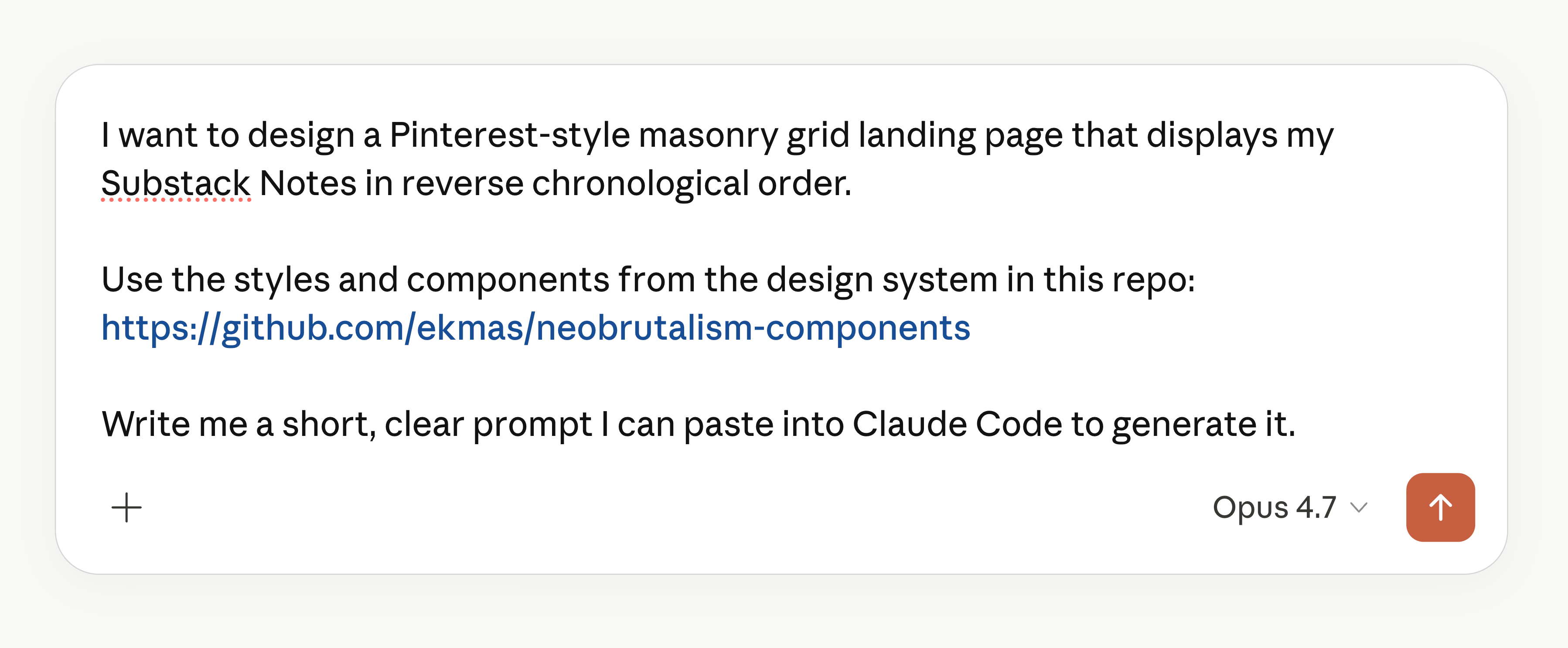
Then, Claude.ai generated the following prompt:
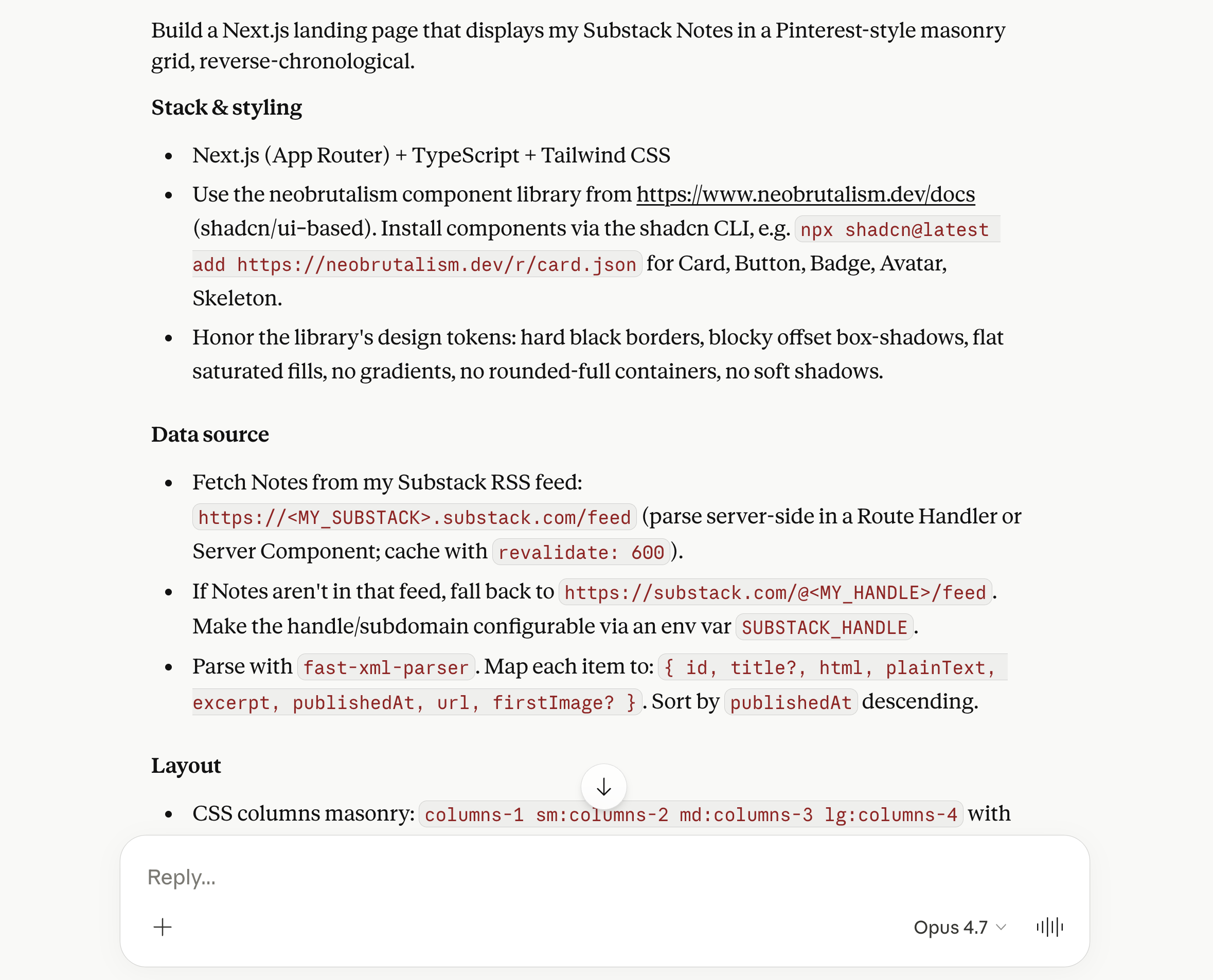
Then, I provided my Substack URL and pasted the prompt into Claude Code to generate the designs.
2. Load my Substack Notes
I initially tried pulling notes live from the Substack API and was excited about the approach. To automate the process, I even built a Claude skill that could easily retrieve the notes on demand.
However, I repeatedly ran into “429 Too Many Requests” errors and realized that Substack aggressively rate-limits access to that endpoint.
After trying several workarounds without success, I opted for a simpler solution: a Python script that retrieves the notes directly.
Worked fine for the time being.
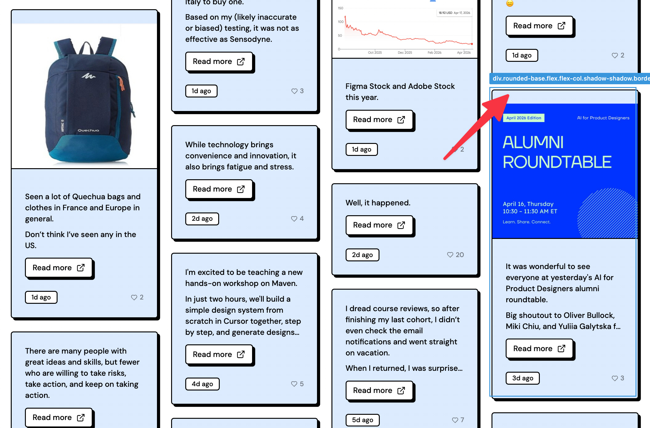
Step 3: Make visual improvements
1. Fix the zig-zag bottom edge
After asking AI, I learned the main issue was that some cards were much taller than others.
So I made several changes to fix it.
1) Remove the top padding in cards
2) Define the image aspect ratio: “Images should scale proportionally, but never be taller than 16:9. Only crop if necessary.”
3) Tell the AI that although cards should be sorted from newest to oldest, it can slightly reorder adjacent cards to better balance column heights.
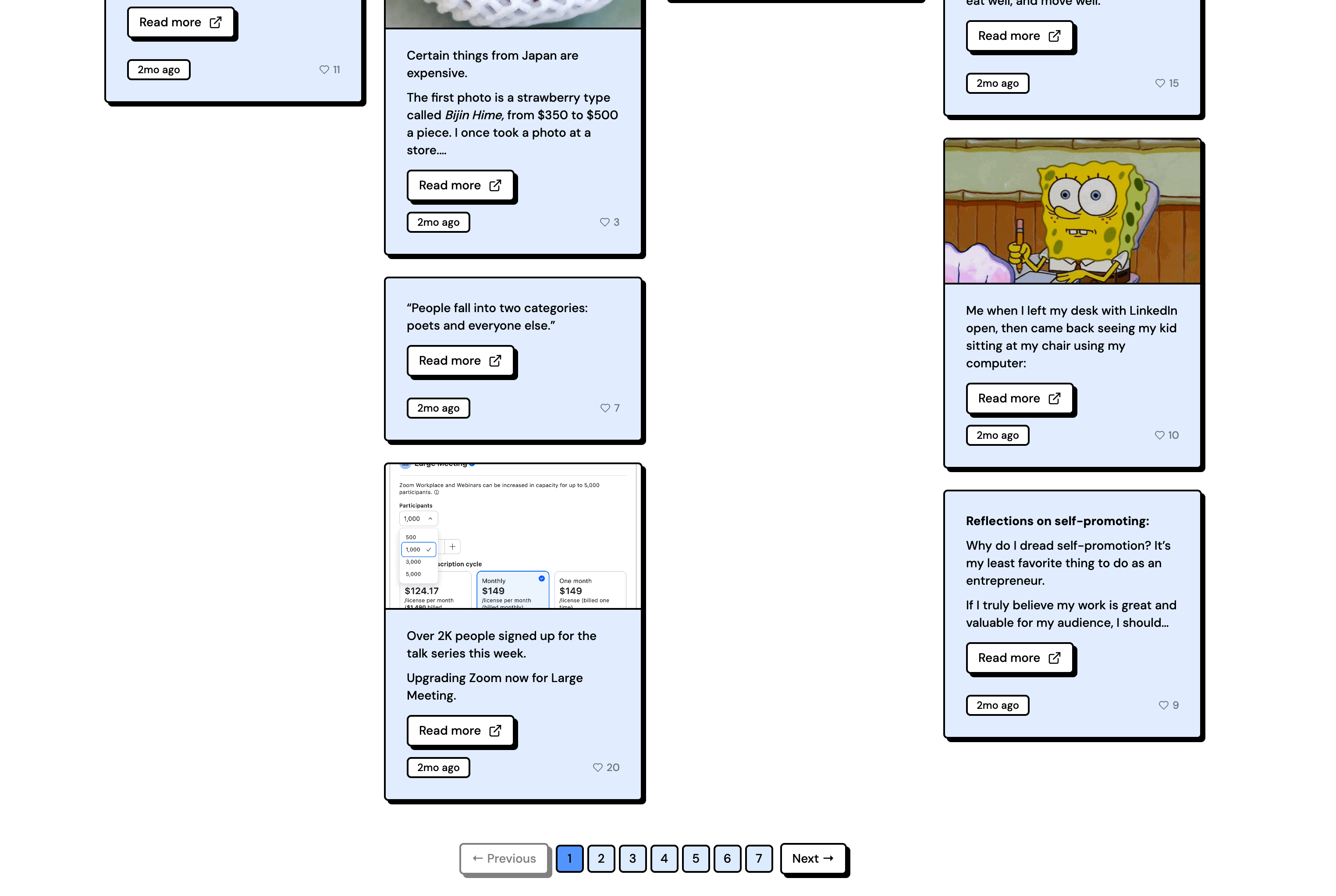
4) Define how many cards appear per page. I found that 200 cards was the sweet spot.
2. Improve the navigation experience
Although I made the fixes above, the zig-zag issue wasn’t fully resolved.
I realized that a masonry grid doesn’t work particularly well with page-based pagination. Infinite scroll would be a better fit.
But switching to infinite scroll introduced new navigation challenges, especially since I had written over a thousand notes.
So I added the following improvements to complement the infinite scroll experience:
Add year filter pills so readers can jump straight to notes from a specific year
Add a sort dropdown for newest, oldest, or most liked
Step 4: Connect to Github
Connecting to GitHub helps with version control. And collaboration too, if I were working on a team.
At this point, the project was starting to take shape, and I was about to experiment more aggressively, so it felt like a good time to back everything up. (I could have connected it to GitHub earlier as well.)
First, I created a new repository on GitHub.
Since I already had an SSH key set up on my computer, I didn’t need to configure it again. An SSH key is essentially a secure credential that lets my computer authenticate with GitHub servers.
Next, I simply asked Claude Code:
Connect this project to my gitHub repo: [URL]
Lastly, I asked it to:
Push to github
Step 5: Explore another visual style
1. Create a branch
I wanted to experiment with something larger than the small fixes I made in Step 2.
Since I wasn’t sure whether I’d keep the changes, I asked Claude Code to create a new Git branch first. I prompted:
Create a new branch called creative-exploration and switch to it
The point of branching is that I can always revert to the main branch if I don’t like the experiment, or merge it back in if I do.
It’s similar to creating a duplicate in Figma. I can discard it if the experiment doesn’t work, or make it the main version if it does.
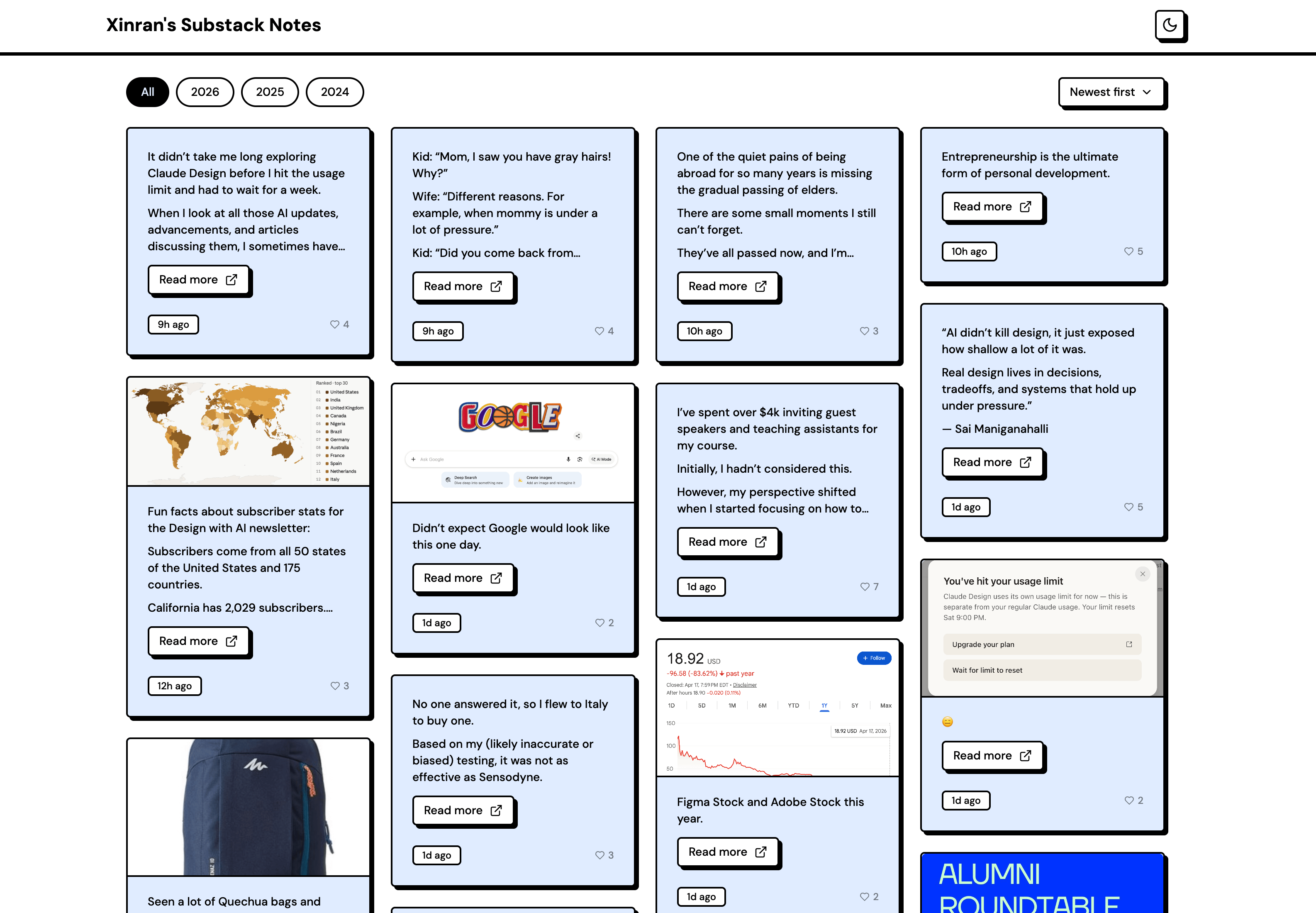
As I mentioned in Step 1, I still wasn’t fully convinced about the readability of black text on blue cards. Since the text is the most important element on the page, I wanted to prioritize legibility.
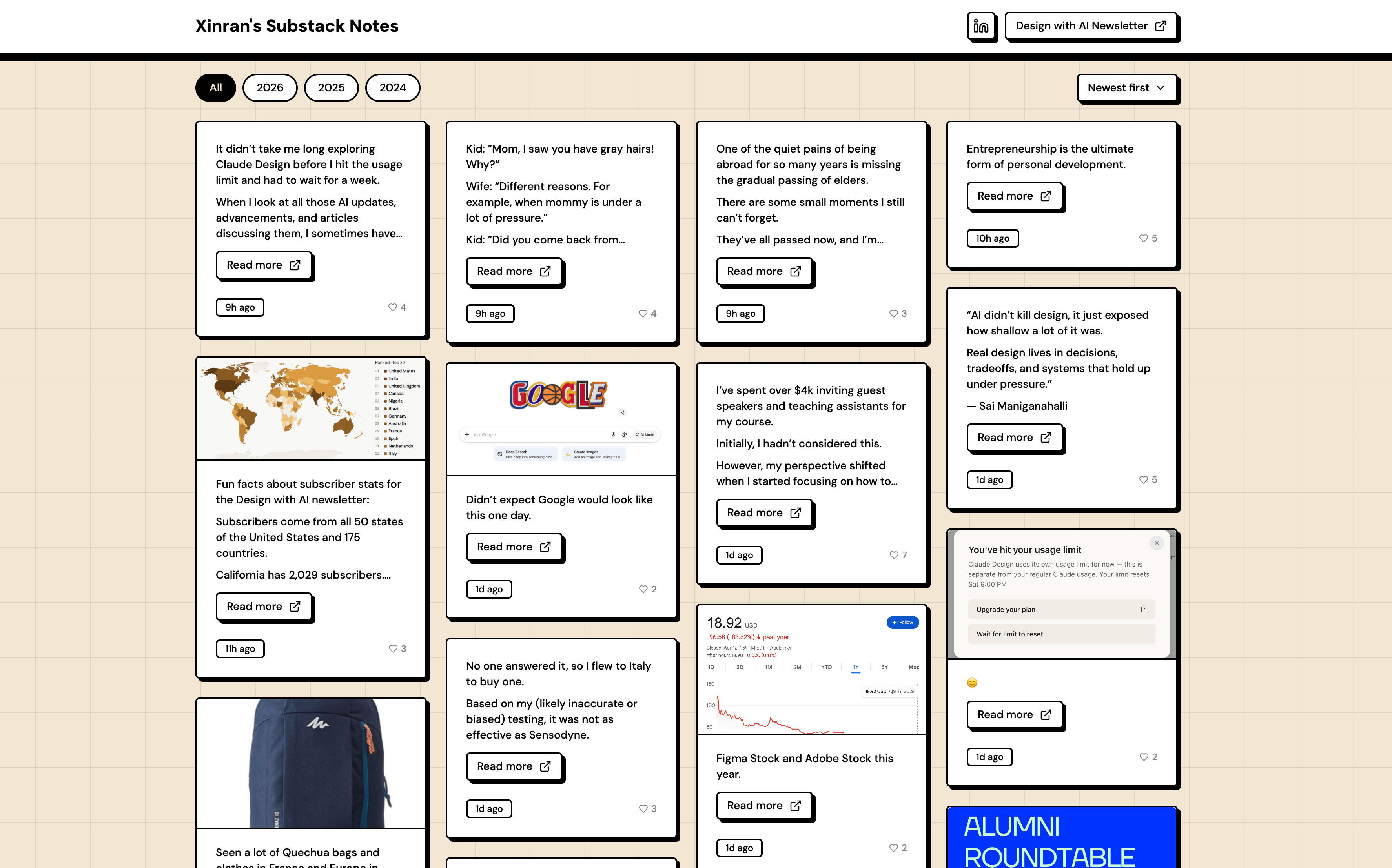
That led me back to the most familiar and readable pattern: black text on a white background.
But if the cards became white, the page needed stronger contrast to keep the cards visually prominent. So instead of coloring the cards, I added color to the page background.
Here’s the result. I chose a soft beige tone that felt much less distracting than the original blue.
2. Explore the cursor design/effect
Honestly, I didn’t expect to spend over an hour exploring and iterating on the cursor design and effects. Speaking of a designer’s little pleasures.
Originally, I designed a large minimalist geometric arrow with a hover effect for the CTA buttons.
But I ended up going down a bit of a rabbit hole experimenting with different cursor styles and interactions. I wanted to add some personality to an otherwise minimal site, without making it feel distracting.
The large arrow worked, but it blended in too much with the cards and typography. I also wasn’t satisfied with the hover effect. I tried a cross shape, then a blocky hand cursor, but both felt too visually heavy alongside the existing button hover effects.
After many iterations and getting inspirations from CodePen, I landed on a simple dot shape with a subtle trailing effect. It still carries visual weight, but in a quieter way. It feels related to the other elements on the page while still standing apart, creating a balance of harmony and tension.
3. Merge it back to main branch
I was happy with the exploration, but I still wanted to compare it side by side with the earlier blue version from the main branch.
So I used Git worktrees to run both branches as live development servers simultaneously and compare them directly.
Worktrees were a relatively new concept for me, but they turned out to be a great fit for this workflow. I was actively experimenting in one branch and wanted a quick way to switch back to another without interrupting my work in progress.
There were other ways to achieve the same result, but worktrees felt like a lightweight and convenient solution for this kind of use case.
After comparing the two versions side by side, I preferred the newer direction. So I asked Claude Code to merge the branch back into the main branch, making it the primary version moving forward.
Step 6: Deploy the app
If GitHub is like a storage room where I (and my team, if I have one) keep track of files and changes, then deployment is the process of taking those files and turning them into a real, working website that anyone on the internet can use.
1. Push the code to Github
First, I needed to make sure the latest code was pushed to GitHub.
Since the project was already connected to GitHub, I simply asked Claude Code:
Push it to Github
2. Link and import repo to Vercel
Since the project was already built with Next.js, the easiest way to deploy it was with Vercel.
(I talked about Next.js in this article and that article.)
Since I’ve already had a Vercel account (https://vercel.com) and authorized my Github account, so on Vercel’s dashboard, I just need to import the Git Repo to Vercel.
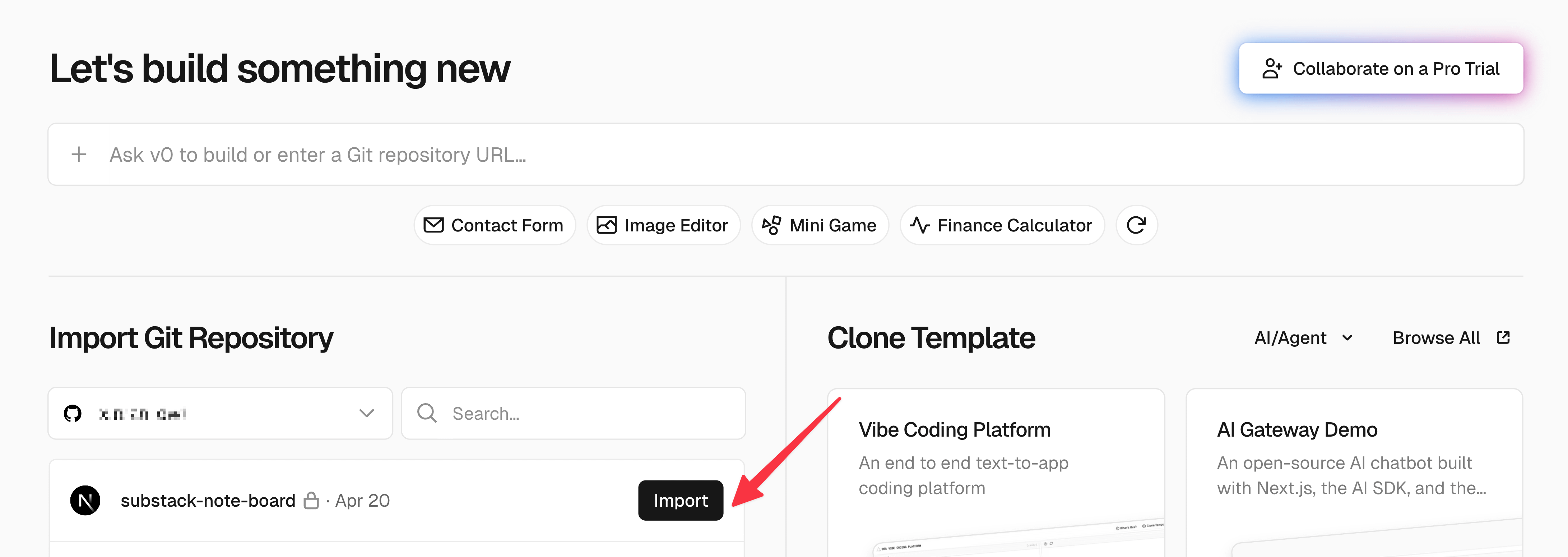
Then it leads to this page.
Then I can just hit “Deploy”.
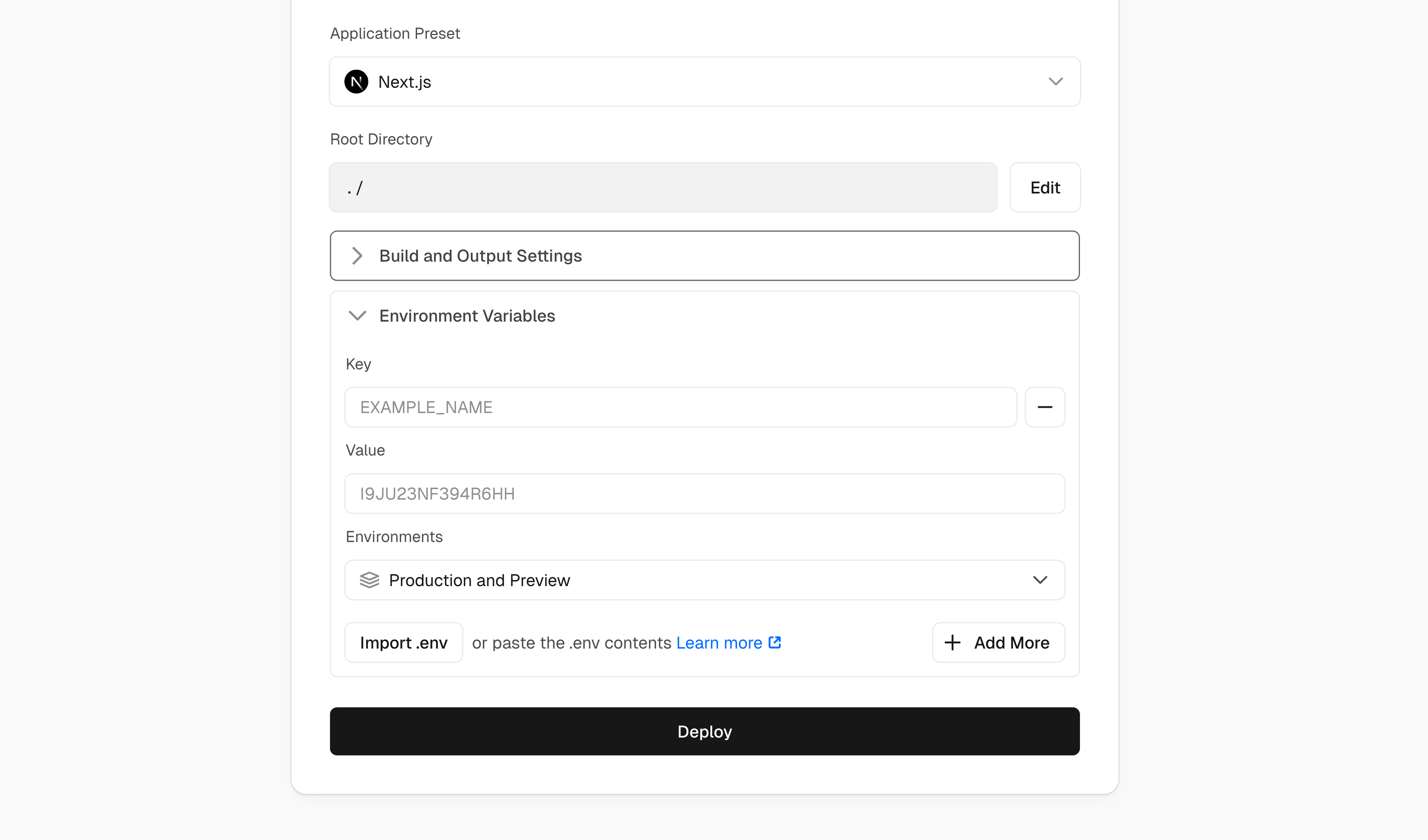
3. Side note on Environment Variables
Although I clicked “Deploy,” there are cases where I also need to fill in the “Environment Variables” section. You can always check with Claude Code to see whether anything needs to be added there.
Environment variables in Vercel are essentially the same as the “.env.local” file on my local machine. They’re used to safely store sensitive information such as API keys and credentials.
The “.env.local” file is typically listed in “.gitignore”, which means it never gets uploaded to GitHub for privacy reasons. So if that file contains important values, I need to manually add them to the “Environment Variables” section in Vercel during deployment.
In my case, I had two values stored in “.env.local”: my Substack user ID and handle. But since those values were also hardcoded in “src/lib/substack.ts” for convenience, I didn’t need to enter them again in Vercel.
Overall, because all the data used in the app was already public, filling out the “Environment Variables” section was optional in this case.
4. Debug the errors
Since deployment builds the project in a clean and controlled environment with very little tolerance for inconsistencies, it can surface small issues such as:
The “pnpm-lock.yaml” file being out of sync with “package.json”
Vercel being strict about the pnpm version used to generate the lockfile
“@types/dompurify” existing in “package.json” without the actual “dompurify” package, which confused TypeScript during the build
To fix these issues, I copied the deployment logs from Vercel and pasted them into Claude Code for guidance.
After following Claude Code’s instructions, I clicked “Redeploy.”
From that point on, I could simply push updates to GitHub, and Vercel would automatically handle the deployment process.
That’s it for this week.
See you next time,
Xinran
-
P.S. Honored to be featured as a top expert in design on Maven. (Also known as “Maven 100”)
Thanks for sharing your process Xinran! Substack really doesn't make it easy to keep track of older notes. I've built a Python app to store and navigate my own notes, and you've given me a lot of ideas on how to improve the design.
Great article