

🐴 How to use AI to generate design variations from an existing design
Workflow, prompts, and tools

☀️ Happy Friday!
How to leverage AI to generate design options based on an existing design?
It is a common use case:
Maybe you think the current landing page is too cluttered and want to improve it.
Maybe you're designing but feel stuck with just one idea and you wish you had more design options for inspiration.
However, I haven’t seen this mentioned much online around how to use AI to tackle use cases like these.
So today, I’ll walk you through some examples step by step, including the prompts I used, the workflow, and the results.
Let’s get started!
Overview
Since I only needed to focus on the frontend design, I used V0 and Magic Patterns for the demo. I chose them intentionally because they are both AI prototyping tools optimized for the frontend.
Either tool can do the job, but I ran the same set of prompts in both tools so you can get a better understanding of what they can achieve.
If you are interested, you can also run the same workflow in other tools like Cursor, Windsurf, or Bolt, and let me know how it goes.
The workflow had two steps:
Step 1: Ask AI to analyze the design and generate suggestions for improvements.
Step 2: Ask AI to generate design variations based on its suggestions.
(If you are clear what design improvements you want to make, you can surely combine steps 1 and 2 into one simple step—just upload the design, provide your suggestions, and ask AI to generate new design options.)
I used the top section of Kayak.com as the existing design for the demo.
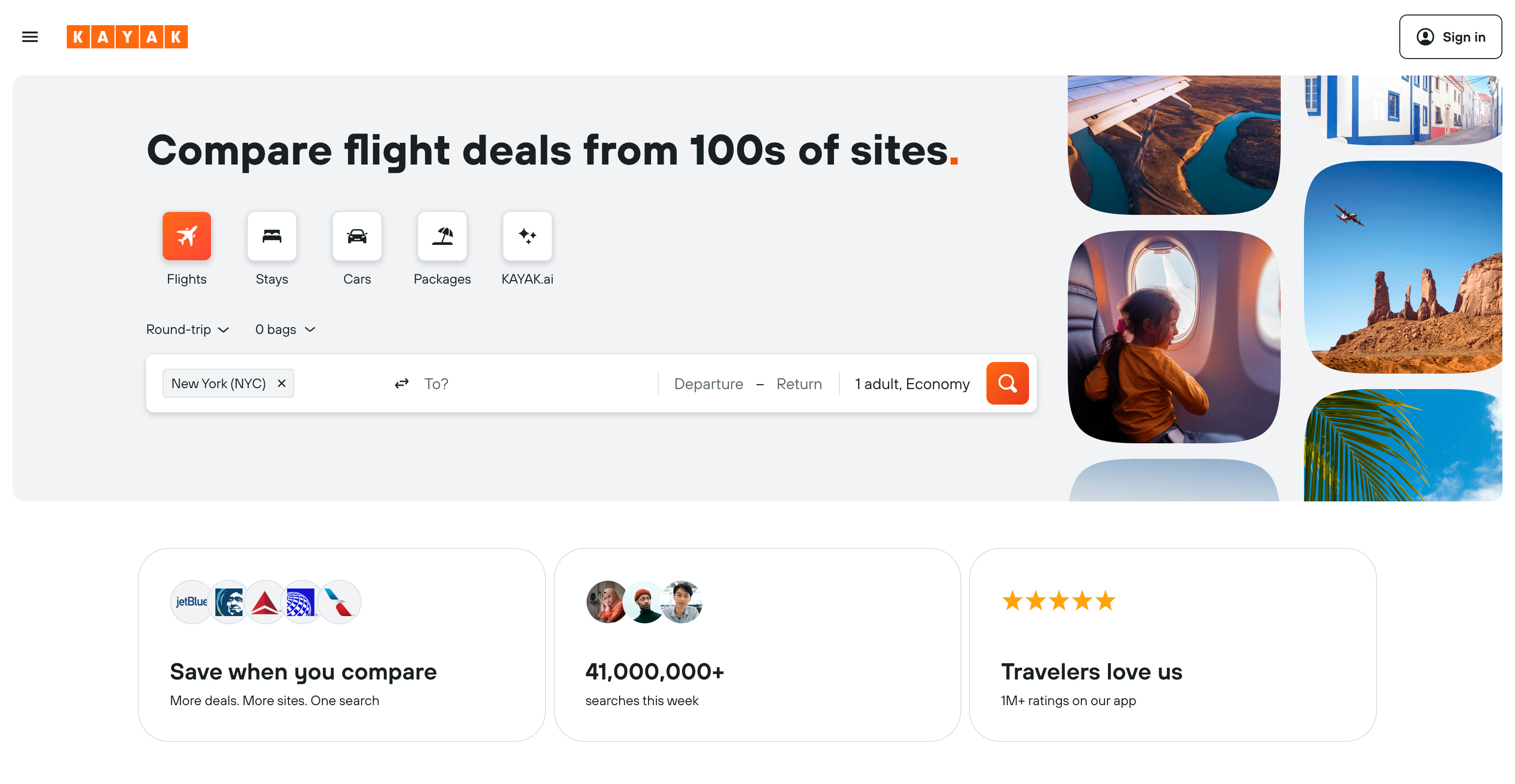
Question: Take a closer look. How would you design it differently?
The First Prompt
This is the first prompt I put into both V0 and Magic Patterns, along with a snapshot of the top section from Kayak’s homepage.
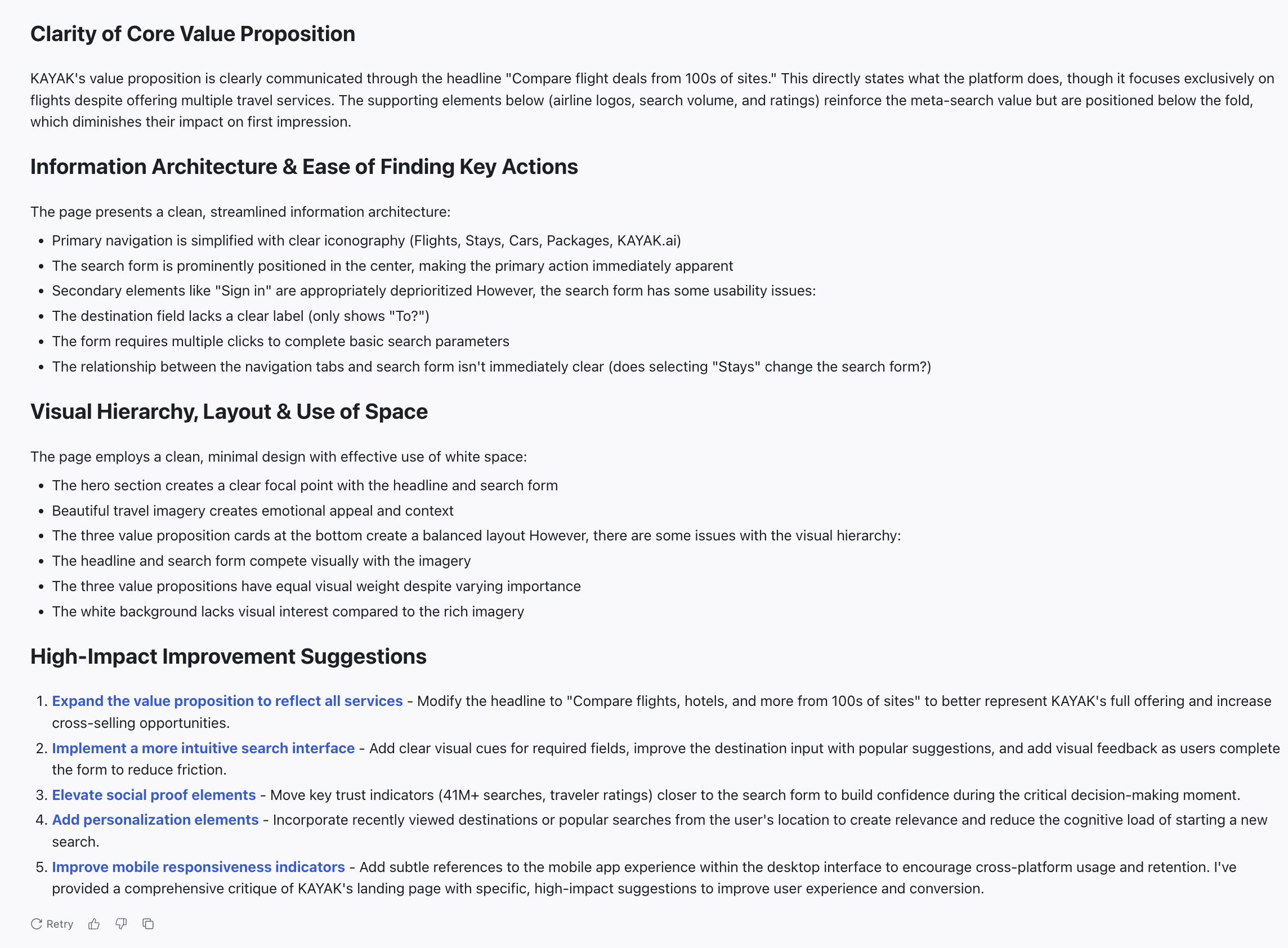
Provide a design critique of Kayak's landing page (see attached snapshot).

Act as a seasoned product designer with deep UX/UI expertise.

KAYAK's primary business goal is to empower travelers by providing them with travel planning tools. Its search engine scans various travel websites to offer a wide range of options and prices for flights, hotels, rental cars, and vacation packages.

Its primary users are everyday travelers looking to search and compare travel options.

Please evaluate the desktop homepage with the following lenses:

- Clarity of core value proposition
- Information architecture and ease of finding key actions
- Visual hierarchy, layout, and use of space

Also include 3–5 specific, high-impact suggestions to improve user experience or conversion on the homepage.
As you can see, I also included the primary business and user goals—a small tip to give the AI more context for the design analysis.
V0
V0’s design analysis:
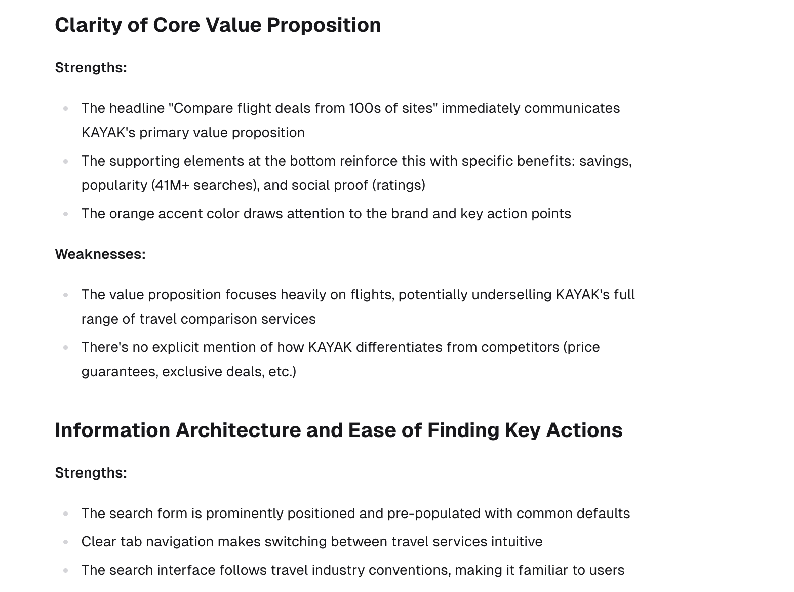
A long list of analysis. Not bad for inspiration. And I can probably get similar results from ChatGPT or Claude.
(The next step was to generate design options based on these suggestions. But as I mentioned earlier, in reality, I can also provide my own design suggestions instead, like “The current design lacks clear visual hierarchy and has excessive white space. Can you generate three design options to address this issue?”)
Next, I asked V0 to generate design options:
Based on the suggestions above, can you generate 8 alternative design options for the snapshot of Kayak's homepage?It took a long time to run (as I expected), about a minute per design option. So I clicked “Stop” and reduced the amount from 8 to 3 in the prompt:
Based on the suggestions above, can you generate 3 alternative design options for the snapshot of Kayak's homepage?V0 generated 3 design options in about 1.5 minutes:
Design 1: Enhanced Core Experience
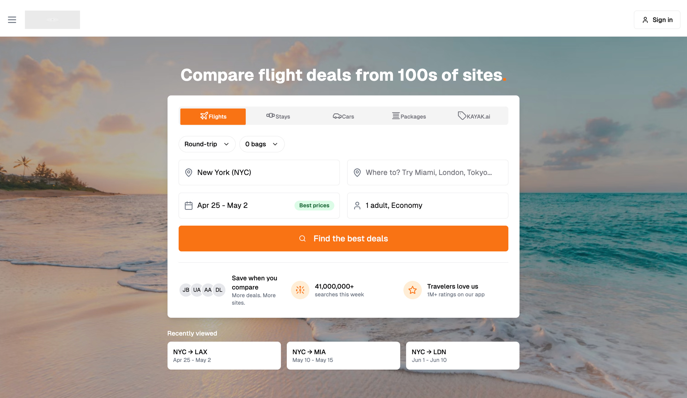
Design 2: Immersive Hero Experience
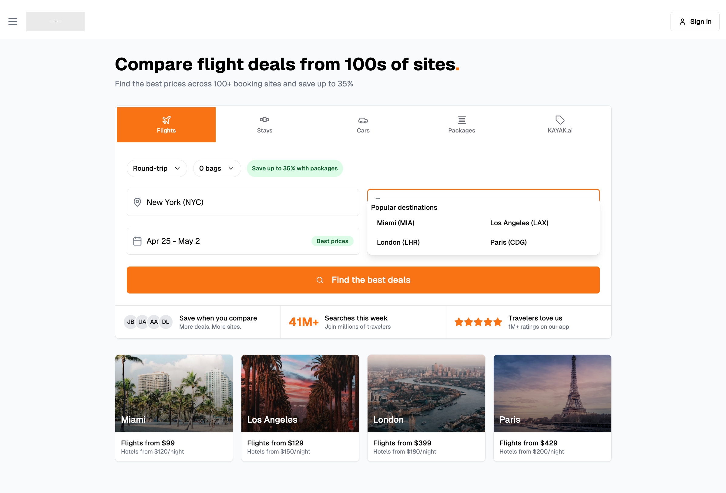
Design 3: Destination-Focused Experience
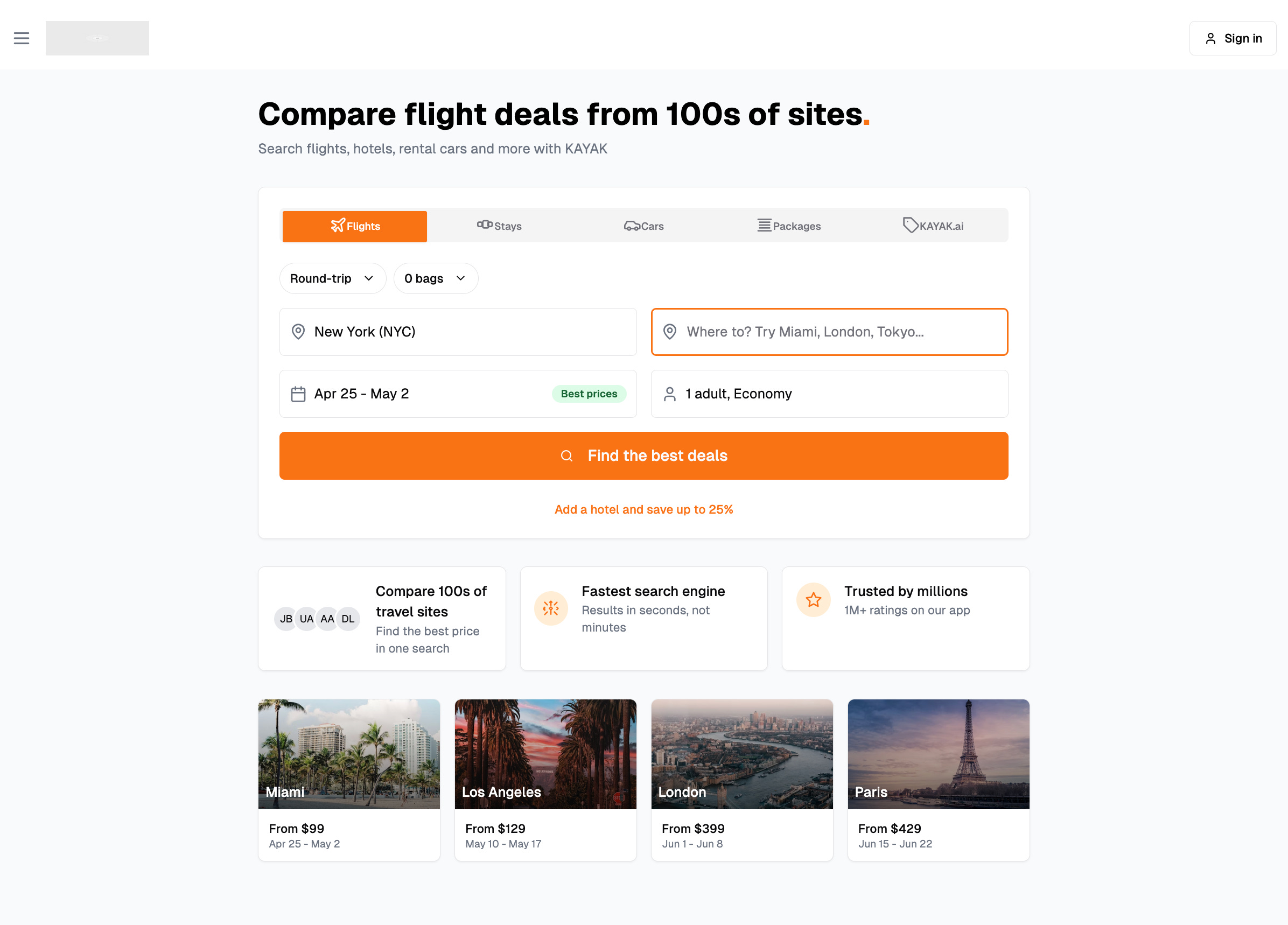
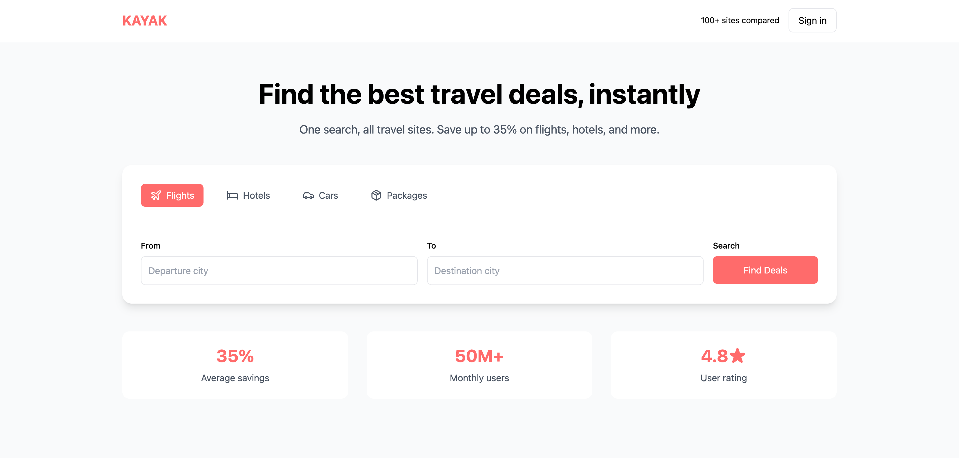
Design Option 1: Enhanced Core Experience
Snapshot of V0’s description:
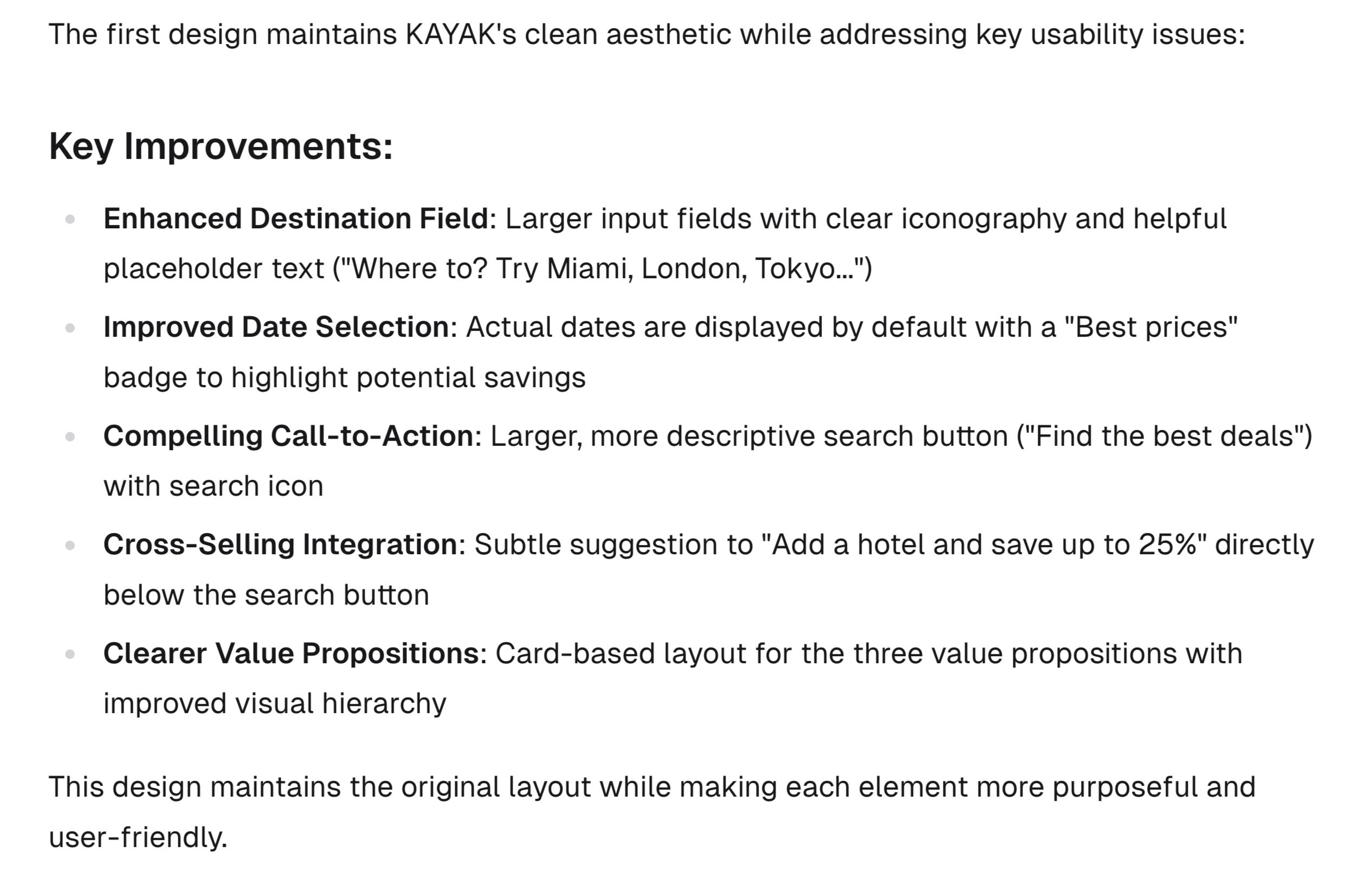
The design it generated:
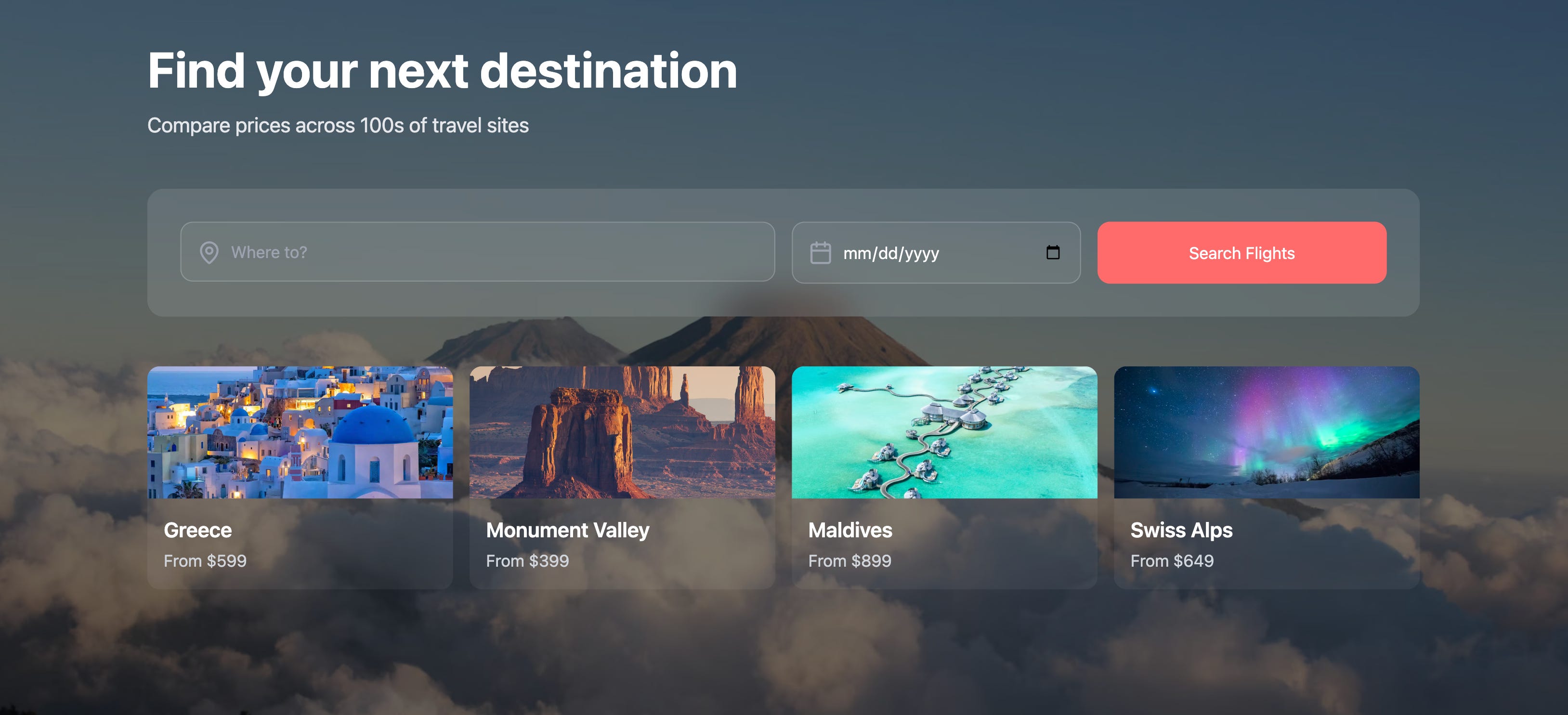
Design Option 2: Immersive Hero Experience
Snapshot of V0’s description:
The design it generated:
Design Option 3: Destination-Focused Experience
Snapshot of V0’s description:
The design it generated:
Impression
The results were impressive overall. I like the sophistication of the details. It reserved the essential information from the snapshot I provided (color, style, CTAs).
All the designs generated were backed by code with basic interactive effects, such as input field interaction and hover effect.
I wish the design options were more distinct from each other. But I could have tried a follow-up prompt to address that too.
Magic Patterns
Magic Patterns’s design analysis:
Some I agreed with; some I didn’t. For the sake of demo, I simply asked it to generate design options accordingly:
Based on the suggestions above, can you generate 8 alternative design options for the snapshot of Kayak's homepage?Magic Patterns generated 8 design options in 1.5 minutes, faster than I expected.
Due to the space limit of the newsletter, I’ll only show three designs here:
Design Option 1: Enhanced Value Proposition
Design Option 2: Search-First Design
Design Option 3: Social Proof Focus
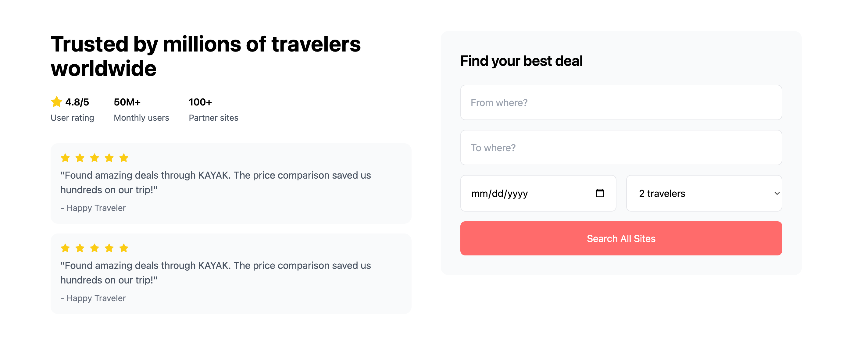
Impression
Compared to V0, the designs were on the simpler side.
It generated more designs in a shorter amount of time, which is great.
I loved its “Import to Figma” feature. I was able to import the generated designs into Figma for further editing.
Besides, it had a chrome extension that allowed me to convert a webpage into React components or Figma. Not perfect, but very excited about what it can do.
Thanks for reading.
See you next week,
Xinran
-
Based on the trajectory, Design with AI will reach 10,000 subscribers in late May or early June. Grateful for your interest and support.
If you have any ideas or feedback on how the newsletter and community can provide more value, please leave a comment or message me on LinkedIn.
Thanks for sharing these results. I'm surprised V0 didn't follow its own advice on the value proposition in the main heading.
I can't fully put my finger on it but I'm really impressed by design option #3 from Magic Patterns. I like the variance. It's something different enough to really test.
Thanks for the tests. I see this useful to create design variations, early prototypes and spark conversations. But most readers and for sure non-designers will be oblivious to the hundreds of hours spent by Kayak team testing their designs, discussing and iterating to give shape to their final designs. They'll probably think this kind of output is all that they need.
The imminent consequence now is that poorly-informed executives (i.e. most) will eliminate or decimate their design teams. I hope I'm wrong, but as the AI design tools get better, it looks like paradoxically we are going to move into an era of really bad UX design...